
Baseball cards have always been more than just pictures of players on glossy fronts. The reverse side tells its own tale. Whether it’s columns of statistics, biographical tidbits, or quirky cartoons, baseball card backs have reflected not only the game but also the culture, technology, and marketing strategies of their time. Over the decades, card backs have shifted from simple data repositories to storytelling platforms. By examining this evolution, we gain insight into both the hobby and the changing expectations of collectors.
Early Years: Cards as Advertisements
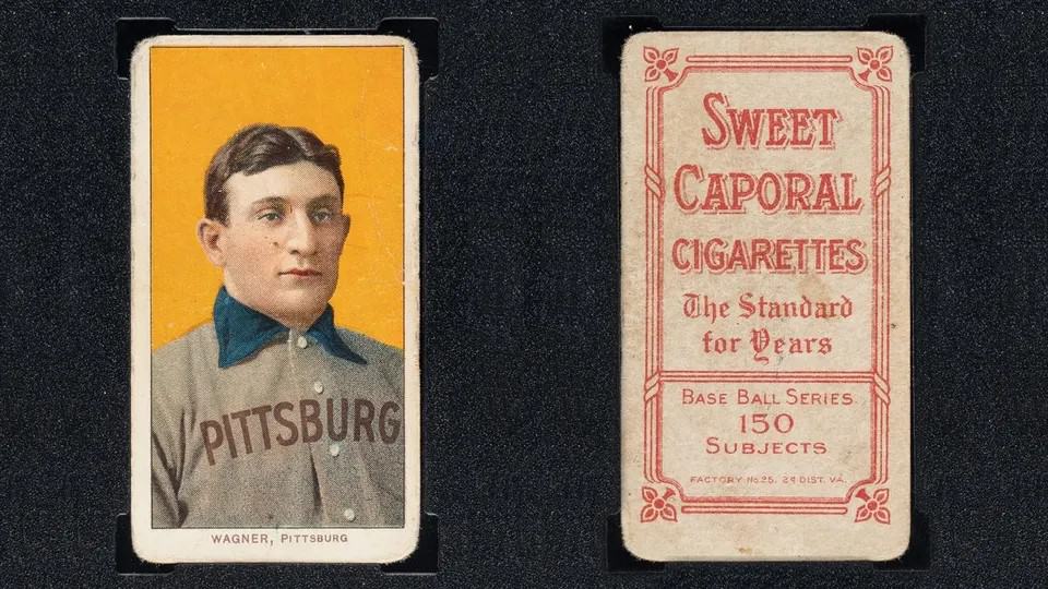
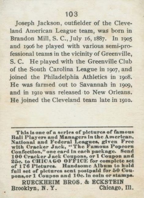
When tobacco companies first produced baseball cards in the late 19th and early 20th centuries, the backs were not player-focused at all. Early sets like the 1887 Old Judge or 1909-11 T206 featured advertisements for cigarettes. The backs promoted Piedmont, Sweet Caporal, or Polar Bear brands, serving as portable billboards. Some backs were left intentionally blank. Printing technology at the time constrained what could be done, as most card backs were limited to one-color ink and simple layouts.
This use of the back as an ad space underscored the card’s original role: marketing, not collecting. Yet collectors would later see these ads as identifiers, with different advertising backs today making certain cards far rarer and more valuable. Already, the groundwork was laid for card backs to carry meaning beyond the image.
1930s-1940s: The Shift Toward Information
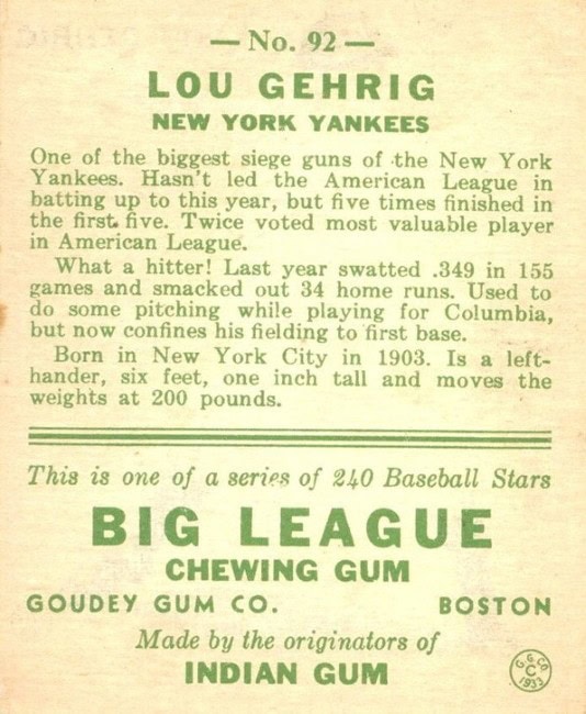
By the 1930s and 1940s, gum companies began using card backs to deliver actual player content. Goudey’s 1933 set was a milestone. The backs offered player biographies and career highlights, replacing tobacco ads with text that engaged fans. These bios were often written in plain, direct language that felt conversational. The trend continued with Play Ball and other prewar issues, which favored short written summaries over statistics.
Printing still limited detail. Black ink on cardboard was the norm, and the backs rarely carried more than a short paragraph. Yet the shift was significant. The card back had transformed from ad space into an educational tool for fans, especially children, who wanted to learn about their favorite stars.
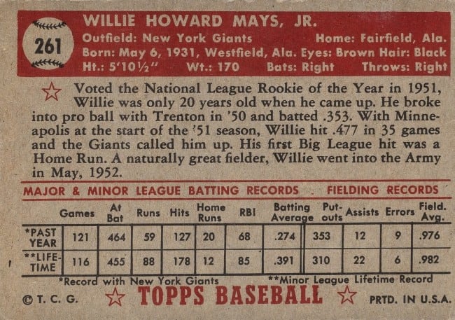
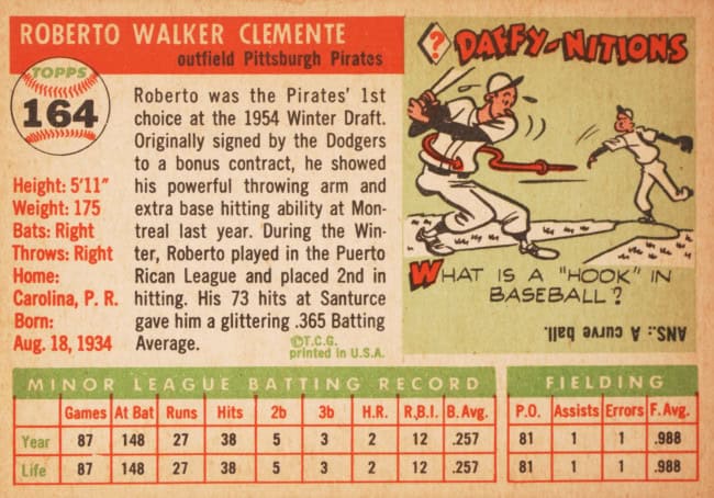
1950s-1960s: The Rise of Full Statistics
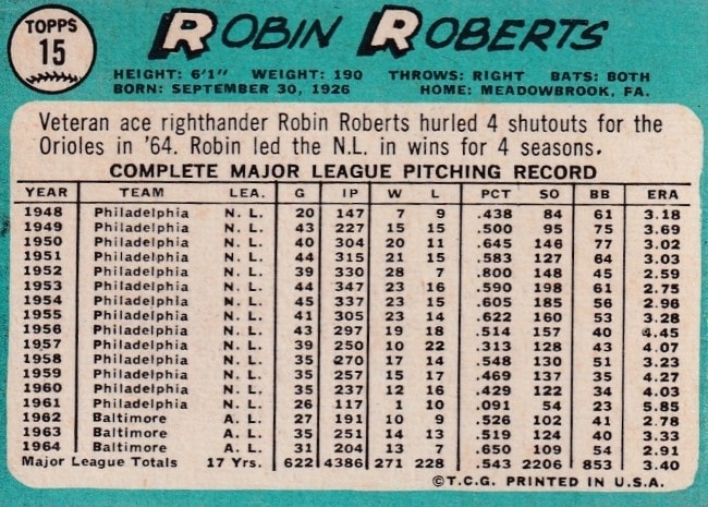
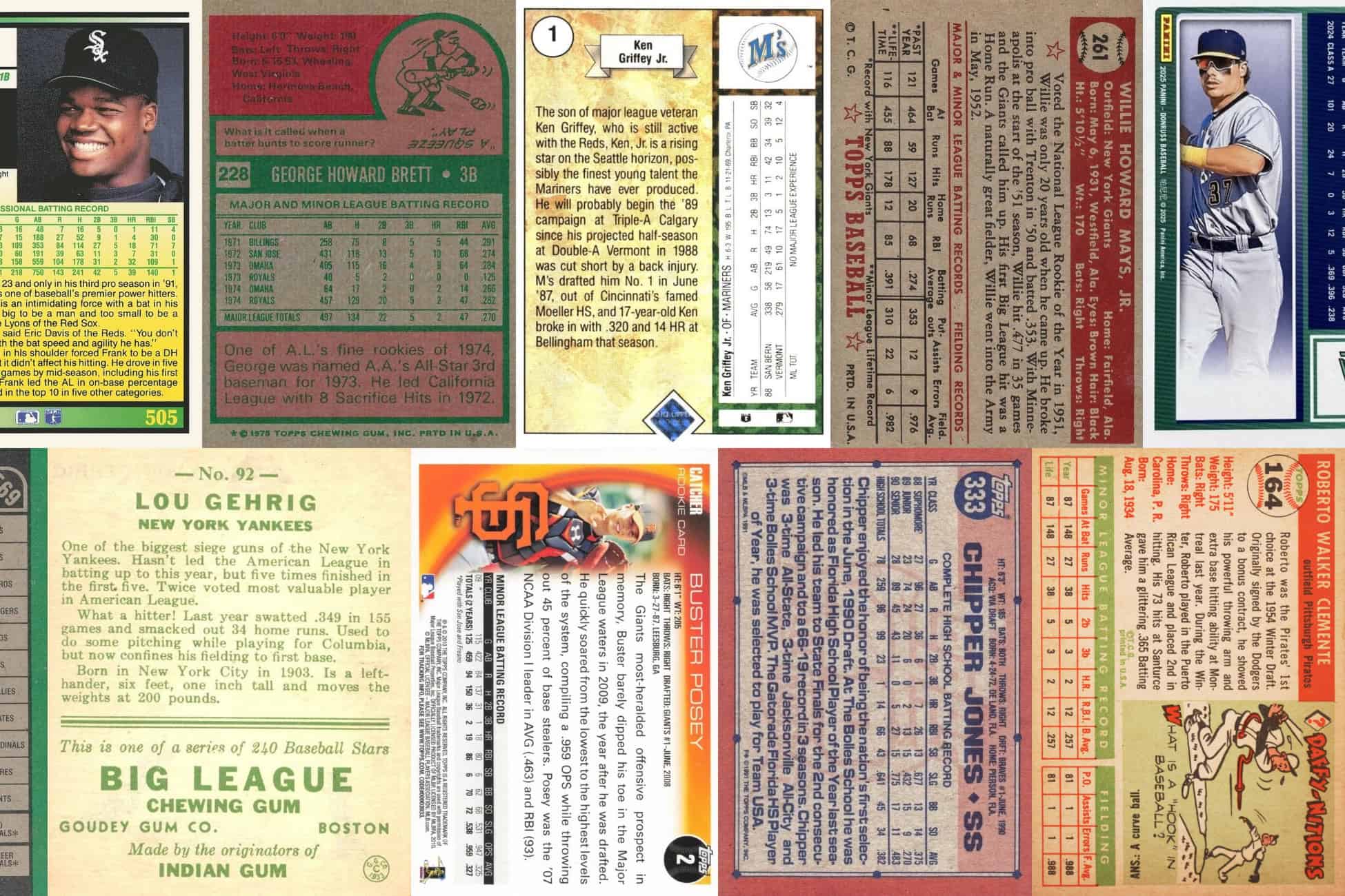
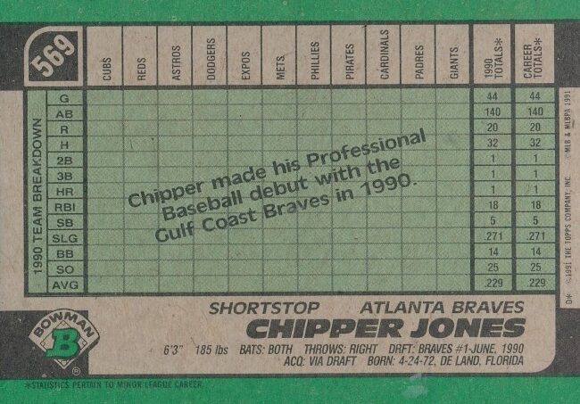
The postwar era brought a greater appetite for numbers. Topps, beginning with its 1952 set, set the standard for how much information could be fit onto a card back. That landmark release included year-by-year statistics, personal data such as height and weight, and short bios. Topps also introduced colorful elements like cartoons that illustrated quirky facts. These artistic flourishes softened the data-heavy layouts and gave young collectors something visual to enjoy even on the back.
Through the 1950s and 1960s, Topps steadily increased the statistical detail. By the 1970s, many card backs featured full career statistics, sometimes with both major and minor league totals. Collectors valued the comprehensive record, and the ability to track a player’s progression season by season made card backs an extension of the sports page. The design constraint was space: fitting long careers into limited real estate required very small type. For players with decades of experience, statistics could dominate the back, crowding out storytelling.
Case Study: 1952 Topps
The 1952 Topps set is famous for its fronts, but its backs represented a leap forward as well. For the first time, collectors saw full-color two-tone designs with career stats, a short bio, and a cartoon trivia section. The design balanced readability with entertainment, making it an early example of how to merge data and storytelling. The use of red and black ink gave the backs a bold, distinct look compared to the more utilitarian designs of competitors.
Collectors noticed. Kids learned about Mickey Mantle’s early career while also seeing his numbers laid out clearly. The template Topps established here shaped the entire industry for decades.
1970s-1980s: Storytelling Returns
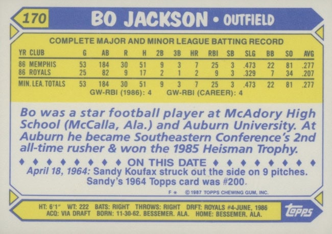
While statistics held center stage, card companies never abandoned narrative. Biographical blurbs, fun facts, and odd tidbits remained staples. Some companies used trivia questions, cartoon illustrations, or historical notes to break up the monotony of numbers. Donruss, which entered the market in the early 1980s, leaned heavily into storytelling. Their card backs included career summaries written with a flourish, reminding collectors that players were more than numbers.
Fleer also experimented, including both statistics and brief anecdotes. For example, a card might list a pitcher’s strikeouts but also note his offseason job or unusual hobbies. These additions gave a human dimension to the cards, helping younger fans connect with athletes as people. Collectors often remember these snippets as much as the statistics.
Case Study: 1981 Donruss
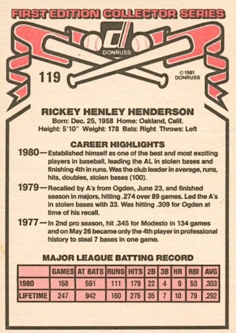
Donruss’s debut set in 1981 demonstrated just how different companies could approach card backs. While Topps emphasized orderly columns of statistics, Donruss presented more text-heavy summaries. Some collectors criticized the clutter, but others appreciated the storytelling approach. Donruss lacked the polish of Topps or Fleer in that first year, but it set the tone for its brand identity: more words, more anecdotes, more personality.
In hindsight, the 1981 Donruss backs remind us that competition in the hobby was not just about photography and design but about how information was communicated.
1990s: Printing Technology and Its Influence

The look and content of card backs have always been shaped by printing techniques. In the early 20th century, one-color printing meant either black or dark blue text on cardboard. By the 1950s, two-color printing became common, allowing Topps to use colored backgrounds, which improved legibility and added visual appeal. Orange, green, and blue became common backdrops, distinguishing one year’s cards from another.
The 1980s and 1990s saw further advances. Multi-color printing enabled more sophisticated layouts, with shaded boxes and logos appearing alongside text. The adoption of computer-based typesetting allowed for crisper fonts and more complex data tables. Companies could now experiment with font hierarchy, bold section headers, and clearer divisions between stats and narrative.
With digital design in the late 1990s and early 2000s, card backs reached a new level of polish. High-resolution logos, team color themes, and dynamic layouts became common. Some sets even included photographs or holograms on the back. As printing improved, the challenge was no longer about fitting information onto cardboard but about deciding what belonged there.
Case Study: 1989 Upper Deck
Upper Deck’s 1989 debut changed everything. The company used premium white card stock and high-quality four-color printing on both sides. For the first time, collectors saw player photos on the back as well as the front. This use of full-color imagery elevated the entire concept of a card back. Instead of just data and text, Upper Deck presented a second visual portrait, reinforcing the premium nature of the product.
The design made traditional stat-heavy backs look outdated overnight. It proved that card backs could be as visually engaging as fronts, and other companies soon followed.
Collector Preferences Over Time
Collector tastes have played a strong role in shaping card backs. In the 1950s and 1960s, young fans prized the statistics because they were harder to find outside of newspapers. Having complete data on the back of a card gave children the ability to compare players and memorize records. The storytelling elements added fun, but the stats were the backbone.
By the 1980s, the explosion of sports media meant fans had easier access to numbers. Magazines, TV broadcasts, and later the internet reduced the need for complete stats on cards. At the same time, nostalgia for the playful storytelling of earlier decades grew stronger. Collectors began valuing creative touches as much as comprehensive data.
Modern collectors often debate the balance. Some prefer clean designs with just highlights and a short bio, while others argue that full career stats are essential. High-end products often cater to nostalgia, mimicking older layouts with long statistical tables. Meanwhile, experimental sets may use the back for storytelling, artwork, or even QR codes linking to digital content.
Design Constraints and Creative Solutions
Card designers have always faced the problem of limited space. Balancing player data, storytelling, and design elements requires trade-offs. Some of the creative solutions over time include:
- Abbreviated stats: Highlighting only recent years or career totals when space is tight
- Rotating features: Using cartoons, trivia, or milestones on some cards rather than all
- Team-specific color schemes: Helping collectors quickly identify the player’s team while giving visual appeal
These decisions reveal much about the intended audience. Sets aimed at children often favor cartoons and trivia, while premium sets for adults lean on minimalism and clean typography.
Printing Techniques That Changed the Game
Printing methods have always determined what was possible on card backs. Each new advance expanded the range of design, color, and detail. The most influential methods include:
- Letterpress printing: Used in the 19th and early 20th centuries, this technique pressed ink directly into paper or cardboard. It limited cards to one color and simple layouts, which is why early backs were mostly advertising blocks.
- Offset lithography: Introduced widely in the 1950s, offset printing allowed sharper lines and the use of two or more inks. This made colorful card backs possible, like the orange and red designs of Topps sets in that decade.
- Multi-color lithography: By the 1970s, printers could combine several colors in one pass, enabling more complex backgrounds, boxes, and visual elements. This paved the way for the playful and varied looks of Donruss and Fleer.
- Computerized typesetting: In the 1980s and 1990s, computers replaced manual layout, allowing for precise fonts and clearer statistical tables. Companies could fit more information into small spaces without sacrificing legibility.
- High-resolution digital printing: By the late 1990s, printers could reproduce photographs on both sides of a card. This innovation, used by Upper Deck, created backs with player portraits, logos, and even action shots.
- Security printing: As counterfeit cards became an issue, manufacturers added holograms, foil stamping, and microtext. These features sometimes appeared on card backs, showing how security concerns influenced design as much as storytelling.
Each leap in technology not only changed how cards looked but also what could be communicated. Without offset printing, the colorful backs of 1952 Topps would have been impossible. Without digital prepress, Upper Deck could not have added back-side photos with the clarity that impressed collectors in 1989.
Comparisons Across Manufacturers
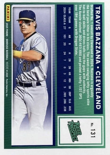
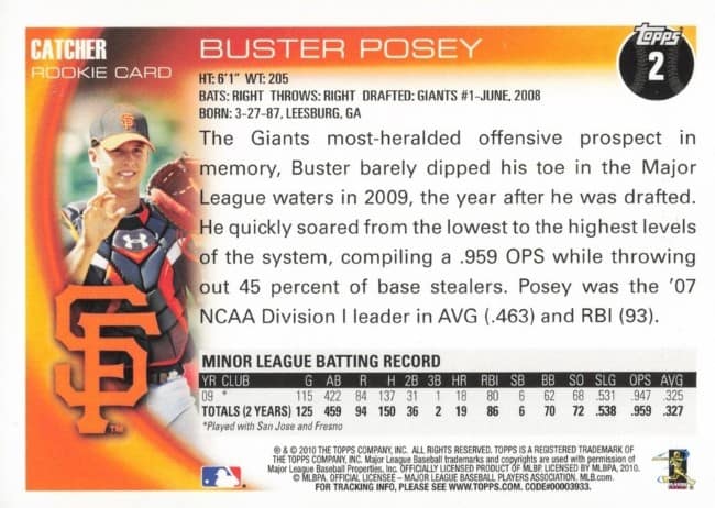
Different manufacturers have often put their own spin on card backs. Topps has traditionally emphasized statistics and cartoon trivia. Donruss leaned into writing, offering rich summaries. Fleer found a middle ground. Bowman, particularly in its modern era, often focuses on scouting reports and prospect analysis, reflecting its niche as the brand of future stars.
Upper Deck, entering in 1989, brought a new aesthetic. Their card backs featured full-color printing and often included player photos on both sides, reflecting a more premium approach. By the 2000s, Upper Deck and Topps both experimented with using the back for brand storytelling, including authentication details for memorabilia and autographs.
What the Future May Hold

Looking ahead, baseball card backs may continue to evolve in two directions. On one side, premium physical cards may strip down information, relying on clean design and perhaps digital links to convey statistics. On the other, nostalgic reprints and heritage sets will likely keep full stat lines, honoring tradition. Hybrid models, such as augmented reality features activated by scanning a back, could bridge physical and digital.
One constant is that collectors will debate what belongs on the back. For some, the complete numerical record is sacred. For others, storytelling is what makes a card memorable. The best designs often strike a balance, offering numbers for the mind and stories for the heart.
Why This Evolution Matters
Card backs are often overlooked compared to flashy fronts, but they reveal how the hobby itself has changed. They show shifts in printing technology, marketing strategies, and cultural expectations. They remind us that baseball is both a game of numbers and a collection of human stories. By following the evolution of baseball card backs, we trace not only design trends but also the changing ways fans engage with the sport.
In the end, the back of a baseball card is more than filler space. It is a canvas for data, narrative, design, and innovation. From tobacco ads to QR codes, it tells a story just as rich as the game itself.